Friday, 1 April 2011
Monday, 7 March 2011
FOUNDATION PRODUCTION EVALUATION
In what ways does your media product use, develop or challange forms and conventions of real media products?
Masthead
I looked at different conventions of mastheads with different genre of magazine I thought about what made it different to other magazine. In order to develop my ideas to make it more imaginative. The names of the magazine each masthead was always in the top left normally and had a different design. It is also one of the biggest things on the front cover so it had to be good. I want the audience to be familiar with my masthead and automatically know what type of magazine it is. For an audience apart from the image the main focus is the masthead. My masthead is similar to the top magazine market so the masthead has an importance. Each masthead has to be unique as well as original. Secondly a convention I have challenged is the microphone attached the hand and the name of the magazine in the masthead. Straight away the audience should know because through the mic they say “check 123” I decided to make it this because it portrays I have only started that I am still upcoming. This magazine is for upcoming artists and the mastheads portrays that so that is another reason why it’s challenged real media products. I took the font of check 123 off da font which is a graffiti type font which appeals to my audience because graffiti normally involved with the teens. I selected this type of font because I feel it has some kind of style to it.
Design
I thought about the design element to my magazine especially, my features page. I thought about the colour scheme to my magazine also in relation to my front cover to make everything correspond. My main colour scheme was black/grey/white with a tint of neon blue. I chose black and white because I thought of it being straight up and that’s how I want my audience to feel that it’s a straight up magazine. I chose the blue because I thought of it as different and unique I also wanted them to feel that it has various sides to it.
In addition to my design I use the image to correspond with the text and the background which is black and white. I selected the artist to wear black and white. This makes it a very ironic black and white theme. It makes sense instead of having a rap artist with a funky background the target audience would be confused. So this challenges media conventions. I also kept the font the same throughout the first page of the features but where i was being interviewed I made the font intalic so you can highlight where there is different speech. most of the text I selected was done in bold so it stands out more clearer, the beginning of the text started off with a big letter at the start in similar to real magazine.
I challenged the normal conventions with the main text being the keywords highlighted. My design images are very creative I added props to it and took another image and added on top of the original image too look like its standing on the prop which is the adidas trainers. I also added a strap line to my features to invite the readers to read on. This is also looks like its written which was taken from da font. I designed it like that so its looks like its personal from the artist instead of it looking all made up.I wanted to give an approach to the audience that the artist is directly talking to them. It also matches my image with the image on the trainers ready to jump and a stern look from the other image making it look like the artist is cocky but yet focused on his music. I also provided advertisement to social networks which challenges normal conventions for instance bootom right with facebbok,twitter etc. aswell as my main image "www.adidas.com"
Image
I feel that my image challenges real media products by making the image match with the text for instance I used the image on my contents page for an advertisement for an award for adidas trainers. The picture has the artist their in the image promoting the adidas which makes it more realistic. I also thought about the presentation for instance the clash of blue and red suited with both people in the image wearing checkerd clothing. The image is also a medium close up with both people init with glasses presents a bit of swagger. The main prop which challenges media conventions is the giant shoe box which makes it very creative and imaginative. I wanted to appeal wider audiences with this type of image. Because its in with the “London look” of today but in the background you can also see dummies wearing the normal clothes for my main target group. The image presents originality but also seems like an everyday life shot. I try to contrast different groups to been drawn into the genre of my magazine.
Language
In my magazine I use formal language but also modern talk for the youths because that’s the lingo my target audience has. My audience would understand the language and interact more with the magazine because it’s their interests. an example of this is on my features page.
By me having modern English it would appeal to my audience whereas instead having a long story in formal English it wouldn't appeal to my target audience so I made my magazine conventional. Another reason is that my target audience are more likely to be working class,lower middle class and may not understand complex launguage so I was wise with what type of launguage to use.
I also provided an interview in my text to attract the readers on what they really want to know about the audience with a mixture of formal questions and modern responses. I wanted to get my readers thinking and as if their having first hand experience in the story. I also thought about the realism in my language to make things realistic to inspire the audience.
Layout
Layout
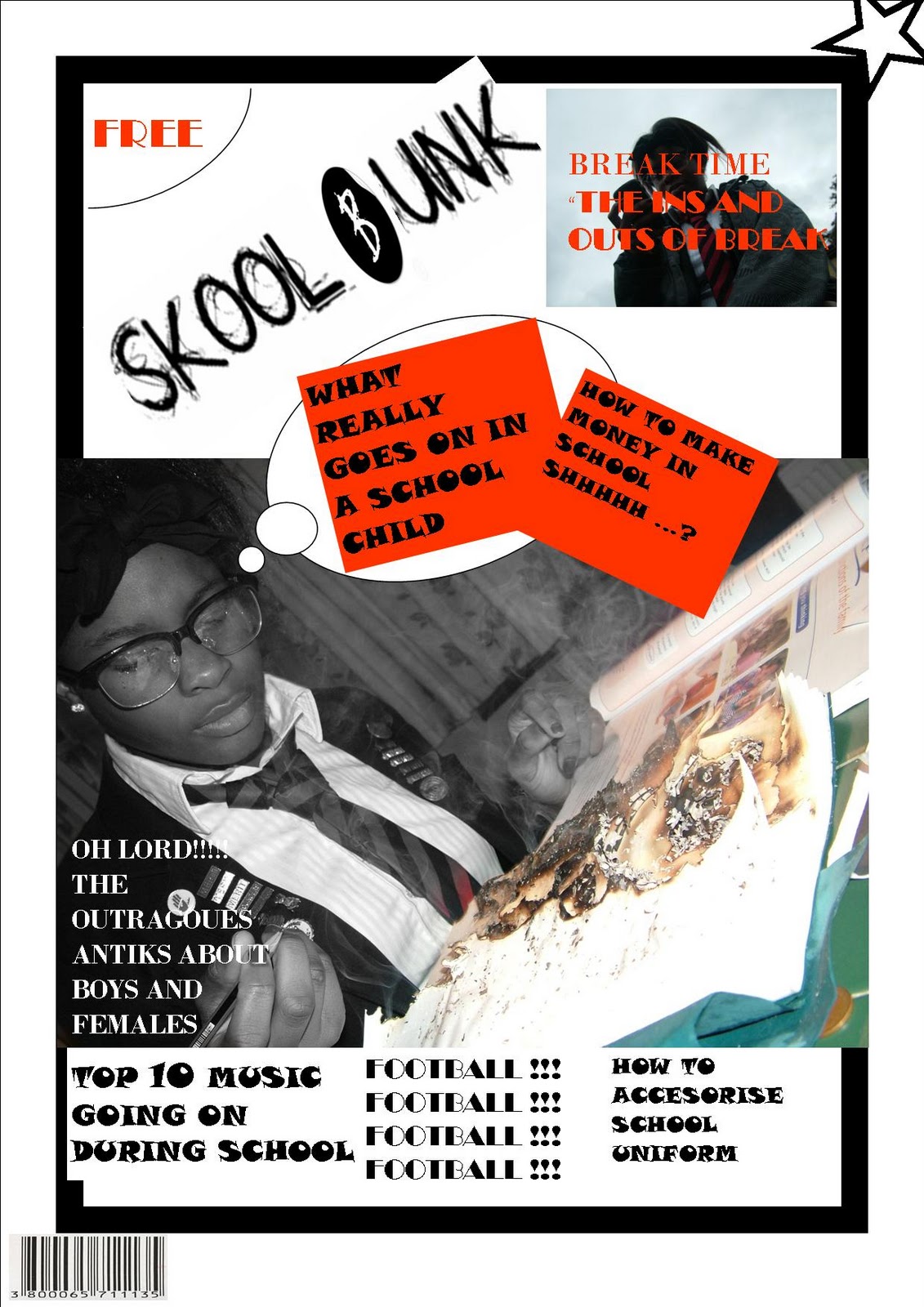
My contents page challenged normal conventions with its layout but in some ways contrasted and developed in ideas. I initially thought of the layout of my contents page to be crazy and all over the place but this was difficult because it made it harder to navigate. I started off with a mini article at the bottom and a competition to win adidas accessories. Due to real conventions put the prizes at the bottom of the page but I also put it close to the artist so it looks like its being promoted. Reasons for putting the article at the bottom is to not bore my readers straight away but to keep them intrigued and eager to read on.
Furthermore, I then went on to think about how am I going to make it easier to navigate and to format the layout. I place my masthead at the top left so the audience know it’s an official contents page from check123. Most readers will relate to the masthead because it is what is mainly seen. I placed two main boxes in a symmetry line of each other so it was easier to read this was in the center of the page. I tried to fill up the top half of my page with designed text and graphic image. I tried to show realism in the magazine to seem laid back, in the way the magazine looks in its format.
I included a bright theme to my layout to make it unique but original to its design on the front cover keeping the grey and black theme.The layout of my contents page is into four main sections where the audience doesn't have to read a long list of text,it is short and straight to the point to inform my readers and to show a quick perview of what is going to be in the magazine. I inserted two boxes with a list of numbers on each side of the central boxes so the audience can navigate in relation to the topic and page number.
How does your product represent particular social groups?
My magazine represents a particular social group in many ways one being, the way the artist is presented in his body language,language used itself, costume, framing and the design theory of the magazine.
Firstly the target audience are aged between 13 to mid 20. The social demographic that I am aiming for is C-E. It is mainly targeted males with all types of race. I have to think about the price range and most people who are interested in this genre are working class so I had to make the magazine affordable and C to E is accurate for this social group.
I represented that it for males using male dominate colours black & white, the blue which are used by male whereas if it’s for females a lot of pink will be involved. The genre of my magazine is UK grime/rap. UK grime/rap normally wear things like hoods hats puffer jackets and always wear a brand sign they may also wear a long chain. This will represent social groups because it is what they all have in common.
The body language of my artist has a hard serious facer which is stereotypical of a hard man image and rebillion of the youths in today society.In addition to a sense of pain power and talent in this type of genre and always wanting to be “swaggered” out with the brands. In one of my images I presented the artist behind a cage and attempted to frame and present a sense of rebellion, the artist being in the cage also portrays the masculinity of a man being locked up behind a cage, which this social group is interested in.
Below is an example:
What kind of media institution might distribute your media product?
My main intention for check 123 is being distributed independently creating a independent institution. I have chosen to go independently due to I want to create a name for my magazine morover, major independent will take most profits and can control the mass production whereas independent you can decide what you want to do. In addition to, it would be harder independently as there would be lack of funds furthermore major labels have more money due to there major status. Marketing powers will always be stronger within a major independent label.
Ways that I can distribute and publicise my magazine is give away at concerts, access a smaller target audience not to waste funds. I could also do such things as concerts and small gigs to promote and attract. I could use social networks like facebook and twitter as well as YouTube etc. due to these internet links are on the rise in popularity.
Lastly most Independent label try to show an image of their own being not following the norms of a major creating their own brand. Independent try to be different and unique and that’s the way I want it to come across to my audience.
How did you attract the audience?
Advertisement is really important to attract the audience.
I attracted the audience through image being the way the artist is dressed for example a hood. So straight way my target audience know what type of genre and magazine it is.
Also advertisement and links to video attracts audience. Secondly, promotion on urban movies for example “kidulthood”, “adulthood” and “anuvahood” this is what my audience like to watch and relate. I can publicise myself on the local radio as well as “channel AKA” which is on the sky box. I could feature images of my magazine in local newspapers to appeal to my audience. Local stores can also distribute my magazine and hopefully will attract the people in the area and will slowly go up.
What have you learnt about technologies from the process of constructing this product?
From the start of my magazine there was several of technology I used to make my magazine I started off with a quality digital camera with a high amount of megapixel and captured many shots so I would be able to select what images are suitable for my magazine I used the camera with different techniques for instance tilted it, over head shots long distance as well as close ups.
I went on to construct my magazine on the software publisher ad learnt how to format my magazine for instance put it on a double page. I also learnt what type of page is needed for my magazine. Moreover, I learnt how to save my publisher work into a JPEG file which saves as image.
I also used several software’s, websites and the actual camera. I have gained more knowledge using the technology and can improve the appearance of an image for instance to edit my photo I used http://www.picnic.com/ which can change the colour; I lightened some of my images to gain a better quality image. The focus was increased to see the artist and the props. The frame this was done on my front cover image. This website/ software manipulate the image I learnt where to manipulate the image and how to frame an image correct this could be a close up, portrait or landscape. I sharpen my image and faded the background so my main attraction was the artist in the frame.
Secondly I used the software fire works to remove any unwanted things e.g. Background I can use the wand tool on fireworks which leaves the image with a plain white background. By removing the background my image can now go on anything. By cutting out the image you can put it on any scenery and atmosphere.
I lastly learnt how to publish my work on blogger.com learnt how to upload images attach links change fonts and font colour.
Looking back at your preliminary task, what do you feel you have learnt in the progression from it to the full product?
Since I have done my preliminary task I feel that there has been great progression I think the professionalism of my front cover has improved and my manipulation of images. With my preliminary task the text size was all the same also the same colours. Whereas my music magazine, I made the important text larger. I included a banner on the top and created a masthead. The puff that I used on my music magazine looks more professional whereas my preliminary task was more childlike.
I have learnt how to design properly and learn how to layout my magazine properly due to real magazines in the market. My preliminary task looks very simple, all rounded. My preliminary contents page had a lot of space to be used and did not include the necessary information. My cover lines in my preliminary were all close together whereas the composition of my magazine is now well settled up. I also have a colour scheme on my new magazine whereas before I would use any colour that was half decent.
On the other hand I included some factors from my preliminary to my official magazine for instance certain conventions like puffs and bar codes and adapted it. My preliminary contents I selected two images which I captured myself on there also I selected real images on my music magazine. I also included promotion and prizes on my preliminary which I done the same for my magazine in conclusion although I showed great progression in my magazine I elemented some conventions on to my magazine and improved my mistakes that I previously had done.
Subscribe to:
Posts (Atom)