
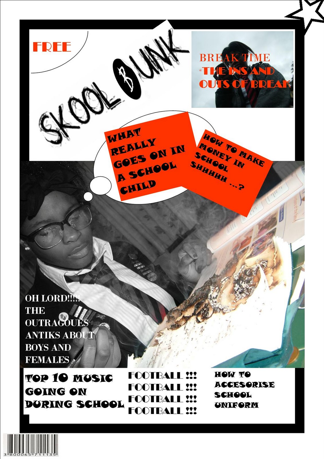
This is my drafting task it is a mock up. The mock up allowed me to know where I want things on my real magazine .The first thing I done was put the masthead at the top so the viewers know the name of my magazine. I inserted an image in the middle of the magazine so the viewers can visualise what type of magazine it is. I put bar code at the bottom because that's the lease important inserted quotes so the viewers can know what type of subjects would be brought up in the magazine. I placed the puff at the top so it can be seen properly. I also created subheading once again to attract the audiences and their interests in what ever the subject topic is about for example football. I was thinking of appropriate topics to be involved within the magazine and something interesting and appealing. I made sure that the person on my front cover was wearing uniform due to its a school magazine so the audience knows what magazine it is from the image and the title this is a prop. I edited the picture using the website picnic. I made sure the person was in black and white and coloured in the book. i think it is presented well trying to suggest what is really going on in a school child mind them wanting to burn their book.

This is my contents page for my mock up magazine i put the heading at the top in a certain font from the da font website also tilted the heading because it looks appealing. I put images relating to what page topic is about for example pg. 11 is about fights an inserted an animation image to relate to that. I made sure all the text and images were the right size colour and font so it can be seen properly. I put a yellow border around the page so it looks more appealing so it doesn’t look so plain and blunt. I got the image of the studio off the Google website aswell as the animation of the two people fighting and i also got the little scroll from clipart which is on the word file. my contents page is very basic but appealing i inserted things like text box just to bring out colours on the contents page also used different font sizes and font colour for instance in the bottom section the font is in red to signify importance. I also manipulated the image on the contents page where the girl is sitting down deciding what bag to pick the image looks very cinematic suggesting for a girl deciding what to wear is very dramatic. so I created a mise en scene trying to set out everything correctly to capture a good shot which i think the outcome was done well.

This is my final outcome of my magazine cover a few adjustments will be made to the cover.
In addition to, with the masthead showing and the title I had to make sure the font size and colours are different for instance I made the important information in a bigger size font so it looks more appealing and because its what the story lines are going to be about I included a barcode so you can scan the price of the magazine and also created my own puff at the bottom left. I got an image of the internet which was the 2010 and made the image size smaller and created shapes which was on the word software and put text underneath to make it look more professional. I made sure my image is in the centre of the screen. I put a quotation from the artist Louie Akz, “my longest diary” which is going to be a feature of the magazine. The colour scheme selected was also blue white making all the main parts white and the others blue matching the clothes the artist is wearing. The name in Louie Akz got from the dafont website as well as the longest diary to make it seem more presentable I researched other magazine and notice how they used different fonts.

I made adjustments to my magazine such as covered the whole image on to the page. I also put my masthead on to the left hand side of the magazine. I inserted a text box with the name music magazine under the masthead and removed the whole top of my heading. This had the title as well as the masthead on either side. I made the main font bold because I feel it’s important and left the less important in plain font. I changed the barcode and also put text underneath with the date and a website based underneath. Lastly I created a banner on top of my masthead and wrote information on what topics are going to be in the magazine. I first made the banner red so it can standout with yellow but I decided to make it blue which was my final design because it matches the font colour.

This is my first draft of my contents page I put my masthead at the top right so people can refer to it aswell as font which I took from da font . which is the con tents I made sure the contents look different by copying different bits by using word with the crop tool. I kept it with the same colour theme of the blue showing. I inserted images of my own which is the black and white picture of a female as well as the the three people standing on stage. The rest of the images I looked up on the google search website. I then made a text box and inserted a numbers in them on the features page each of the information has big font to attract the readers and to show the main story. I made the text box blue on the outside and filled it in the white. I also made each text box at an angle due to it looks more creative also which is the same as the numbers. I made sure the background was grey in relation to my front cover. I tried to make the stories creative and interesting engaging the readers.

This is my contents page I used the NME magazine as a layout and had headings like reviews features advertisement etc. I inserted some of my own images which is the adidas promotion. I inserted images of the internet such as music artist like Tinie Tempah,devlin. I also got album covers of artists who are popular in this specific genre for example lethal bizzle and dizzie rascal. I made the contents page very bright and fun.I inserted a story preview of tinie tempah winning the mobo`s. I also put the contents heading on top so the viewers know. I put numbers next to some text to navigate the viewers to the appropriate page. I also inserted different fonts and different font size to make the page look more creative. I included what the page subjects are and provided information I also included a competition for the target audience to win a prize which is Adidas trainers.

I modified my contents page due to it is easier to navigate whereas before it was much difficult I stuck to the same colour themes very bright and chaotic. The numbers are more easier to visualise with the black background and white text. I grouped the text into catagories which are features and music news. I also changed the text fore each section making it different to other magazine which stick to the same type of text throughout.

I got this image of google as a sort of idea how I want my features page to look like. it is from the vibe magazine with music star Jeremiah. I looked at how they put the image on the page with a quarter of his body cropped I also looked at the props that were added which were the cake. the background is also white with him wearing black clothes so it contrasts the background. i also looked how they presented the features page such like the font colour the font the font size and the font used. I also looked at what subjects story is on the features page and considered how they keep the audience interested. I looked at the format of the features page which is quite basic and straight to the point it is used very well . Ilooked at the heading of the features page and how they presented it.

This is an image which cut the background out. I used the software fire works and used the wond tool to cut out everything leaving just person in the picture. I tried to go with an Adidas theme by adding the prop which is the Adidas trainers. I also wore an Adidas jacket so it matched each other I came up with a few ideas maybe placing images around or in the prop also maybe putting the image on a designed background.

I put my image as my main picture of the features page I also put another image on top of my image on top of my shoe which was the Adidas prop. i then also got font of the da font web site which is on the left hand side saying LOUIE AKZ this was to present the audience what artist it is about. I also went on da font again for the writing I live 2 die I die 2 live this is the artists slogan. I inserted a brief story of the artist on how it begun I kept with the colour schemes i also added the quote which is on the top.
I have inserted another picture at the bottom of my second page of my features. I have inserted my image with all the text around i am still thinking on what to put on the second page and the colour and the font. I need to consider the suitability of the features page. I changed the colour of the second page because its different and I want to keep the same colour theme as my front cover and contents page.

This is my full version of my features page. It includes an interview asking the artist Louie Akz questions on what the audience wants to find out about the artist. I included my image on the features page with a special design being the artist standing on the shoe. I also kept a black and white theme throughout the features. i n my interview I selected the neon colour which is different to other magazines. i used the software fireworks to cut out all my image background and pasted the pictures in a special layout around the text.


 This is my final image and my masthead which i kept the theme of the microphone but this type added an hand where i got the image off goggle i also kept the font which is graffiti of the da font website i made it black and white because i preferred it hat way also ink is around the check 123 emphasis a term of the artist spraying on the microphone i also think it looks original as in the way its presented very authentic and has uniqueness and coolness about it.


 This is my first draft of my contents page I put my masthead at the top right so people can refer to it aswell as font which I took from da font . which is the con tents I made sure the contents look different by copying different bits by using word with the crop tool. I kept it with the same colour theme of the blue showing. I inserted images of my own which is the black and white picture of a female as well as the the three people standing on stage. The rest of the images I looked up on the google search website. I then made a text box and inserted a numbers in them on the features page each of the information has big font to attract the readers and to show the main story. I made the text box blue on the outside and filled it in the white. I also made each text box at an angle due to it looks more creative also which is the same as the numbers. I made sure the background was grey in relation to my front cover. I tried to make the stories creative and interesting engaging the readers.
 This is my contents page I used the NME magazine as a layout and had headings like reviews features advertisement etc. I inserted some of my own images which is the adidas promotion. I inserted images of the internet such as music artist like Tinie Tempah,devlin. I also got album covers of artists who are popular in this specific genre for example lethal bizzle and dizzie rascal. I made the contents page very bright and fun.I inserted a story preview of tinie tempah winning the mobo`s. I also put the contents heading on top so the viewers know. I put numbers next to some text to navigate the viewers to the appropriate page. I also inserted different fonts and different font size to make the page look more creative. I included what the page subjects are and provided information I also included a competition for the target audience to win a prize which is Adidas trainers.

 This is an image which cut the background out. I used the software fire works and used the wond tool to cut out everything leaving just person in the picture. I tried to go with an Adidas theme by adding the prop which is the Adidas trainers. I also wore an Adidas jacket so it matched each other I came up with a few ideas maybe placing images around or in the prop also maybe putting the image on a designed background.
 I put my image as my main picture of the features page I also put another image on top of my image on top of my shoe which was the Adidas prop. i then also got font of the da font web site which is on the left hand side saying LOUIE AKZ this was to present the audience what artist it is about. I also went on da font again for the writing I live 2 die I die 2 live this is the artists slogan. I inserted a brief story of the artist on how it begun I kept with the colour schemes i also added the quote which is on the top.
 This is my full version of my features page. It includes an interview asking the artist Louie Akz questions on what the audience wants to find out about the artist. I included my image on the features page with a special design being the artist standing on the shoe. I also kept a black and white theme throughout the features. i n my interview I selected the neon colour which is different to other magazines. i used the software fireworks to cut out all my image background and pasted the pictures in a special layout around the text.
 For my shooting and selected image I thought about selecting a band for my magazine so I took and image of them up on the stage them performing at a show called big deal. The microphone is there for them to sing the band is going to be on my feature page of the magazine. The background is dark so the band colours were all in bright. It is a live performance as well so it’s realistic. The band is in a specific way where the female is in the middle of the two males and her putting her arms up in the air.
 I tried to do several of different shots and tried to present a sense of feeling this is an image close up of me and in the background is the cage where the death voltage sign is shown. The artist face expression is very blunt and has hardness about him. The background is dark but the brightness of the death voltage sign is still showing from behind. This image I was unsure about because I done similar camera shots and they are all alike in someway. I think the figure of the shot is well presented though.


 Before doing my magazine I had to analyse other magazine to make sure my work was at a good standard. I looked at the structure how each magazine made iconic shot and noticed how they captured a shot. I looked at the edits aswell the background the format of the pictures props to see what I can inspire to do making my image original and professional.
 I then last looked up the image on vibe magazine of the music artist usher wearing glasses it is also a close up of him wearing glasses a chain and a ring. The picture looks very cool of him. Around the picture it says swagger suggesting that usher has swagger.
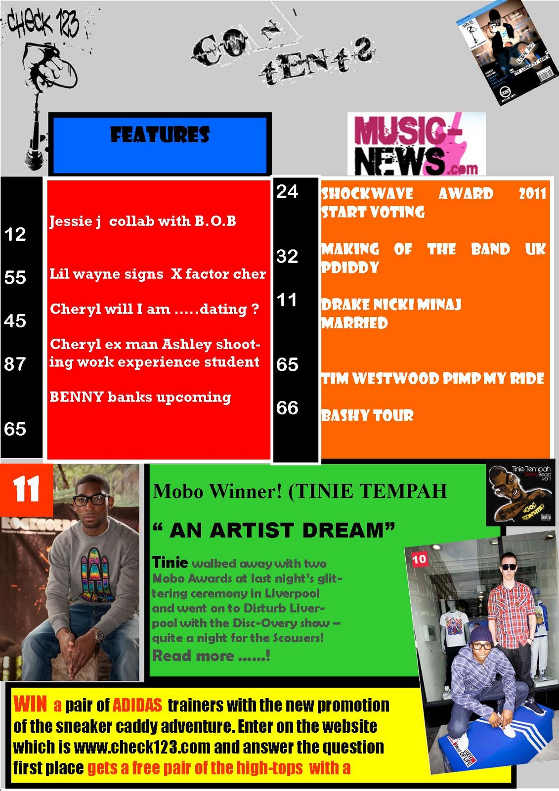