* front covers
* contents page
* features page
I went to nearby store to analyse other magazines such like kerrang, mojo and NME and lastly mix mag. I looked at the headings of the each magazines and the type of images they selected for instance what type of band the magazine selected. I also analysed the colours they went for and how the actual magazine look they go for. I thought about what audiences they tried to appeal. I thought about the genre of the magazines by the type of artist they put on the front cover.
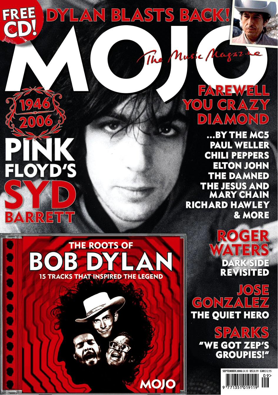


I looked on how each masthead was placed and what type of artist each magazine decided to select. I also analysed what colours were selected for instance with KERRANG the front page looks bright and very hectic gives the impression that it is upbeat. Contrast to that is MOJO.

MOJO seems very basic suggest that the audience is for older generation whereas the NME seems very current with Pete Dorothy on the front page. Mojo magazines have constant colour schemes. The magazine uses a black and white image on there main page. The subtitles are always in colour so in this case it’s red with the bob Dylan cover. Most of mojo magazine have the artist front page with an album or a CD cover showing.
I analysed what things each magazines included for instance things like the masthead the bar code. Many of these magazines have cover lines to get the audience interested giving us and insight what is included in the magazine. Both magazines mojo and NME have several of puffs on mojo its top left and with NME it is centre of the page on the right next to the artists head. KERRANG has a couple of banners and images next to it. All magazines may have a cover slogan or quote from the artist. All the magazines try to appeal to their audiences.
CONTENTS PAGE


This is a sample of a music magazine called vibe its there contents page. In this contents page there is a lot of images based on the contents page on either side of the page with the text running down the middle. The image also has a caption of each of them. The heading of the contents page is showed in a different way as shown
"CO
NTEN
TS,," the writing is in bold . The contents page has originality to it. It has uniqueness because most contents page is not set out. It also attracts the reader to the images and as the reader e notice the middle partying which is white and sense to read the text in between which is the page numbers and what the page consists of. On the bottom write it gives the magazine website and informing the readers on what’s going on with vibe .The latest news and any exclusive thing going on opportunities on prizes to do with V.I.P. the contents page gives the impression the magazine is unique and is different to every other magazine.

This is another vibe magazine contents page. On the content page they feature Ciara who is an R&B artist once again the contents page heading is unique”
"CO
NTEN
TS,," Ciara legs are shaped in a v as well as their is a v shape behind it maybe suggesting view the pages or view the contents page the image focuses on the shape of her legs. This may appeal to men .The information about the pages is done in black. Showing quotes and cover lines. The sub headings are done in grey so the viewers can see the main things so they are interested for instance "boys to men" so we know its going to be about the band. The contents page has elegance to it also the colour scheme is grey black suggesting it’s the dark side to Ciara and to view it we see the insight of the story. The setting is well presented with the artist all in shape with the text on the right side and the image on the left with the heading standing on her heel. The image also has a caption.

This is also another image of a contents page it has very basic colours with the gold heading on top there is also an image on the right side with a lady holding an umbrella in black and white there also a puff in between the lady and the umbrella. The women looks very elegant looking so suggests that the audience is people who have classic taste. The pages of the magazine are along the side. The colours of the contents are not bright. The contents page goes straight to the point. It’s not overly exciting.

The image is them on the right centre with all the text on the other side of the magazine the masthead is always also shown on the top left of the magazine. The sub headings are always the same colour theme which is red white and black. The images selected is always relates to what type of audience that the Q magazine has. The format of the magazine contents page is neat and set out almost listed. I also noticed the page numbers are all even numbers. The main information on the contents page is in different size font so it can appeal straight away to the audiences. It also informs you the new things that are happening and also the past tense as well.

I noticed in this example of the contents page they have the main image on the left hand side and also has also other small images to help picture what going to be on that page. They also have the main text highlighted in a specific way with the yellow text and black highlight. It also sticks to the same genre and all the images have a sense of hectic activity about them. the format is set well neat and tidy but is also listed in certain way where the main text is on the side of every image has a caption near it . The content page has a clear background not a lot of colour schemes not very bright. I noticed most rock genre magazine have artists with tattoos shown maybe because to the audience it seen as art and creativity.
No comments:
Post a Comment